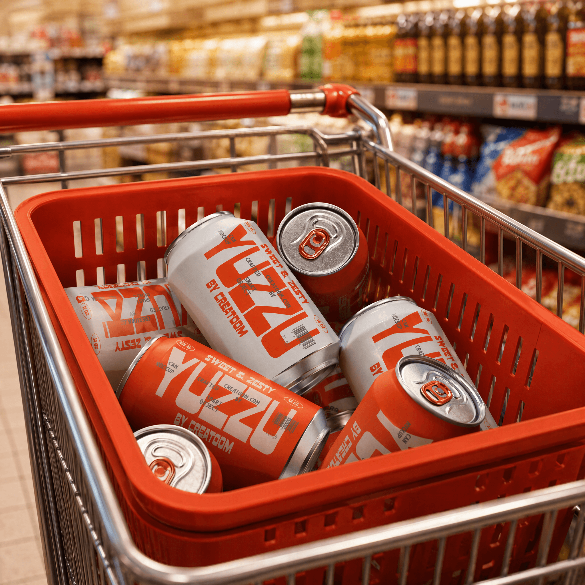
Citrus-bright can design for a crowded cooler.Citrus-bright can design for a crowded cooler.
Yuzzu
✶

Details
Brand Strategy
A strategic shift: Bright, Not Loud.A strategic shift: Bright, Not Loud.
A strategic shift: Bright, Not Loud.A strategic shift: Bright, Not Loud.
Yuzzu needed to stand out in a cooler full of maximalist seltzers without losing its craft credibility. We positioned the brand around bright restraint — bold enough to be seen, refined enough to be trusted.
(WHAT WE DID)
Vision, mission & values
Audience personas
Positioning statement
Brand promise
Big idea
“
Retailers noticed the cans before they even tried the drink.Retailers noticed the cans before they even tried the drink.
Retailers noticed the cans before they even tried the drink.Retailers noticed the cans before they even tried the drink.

Hana Ito
Founder, Yuzzu



Verbal Identity
A voice as crisp as the drink.A voice as crisp as the drink.
A voice as crisp as the drink.A voice as crisp as the drink.
Yuzzu's voice is Bright, Confident, and Concise — copy stays short and citrus-sharp, never over-explaining a drink that's meant to be effortless.
(WHAT WE DID)
Voice persona
Voice pillars
Elevator pitch
Value propositions
Message library
Visual Identity
Citrus-bright, cooler-ready.Citrus-bright, cooler-ready.
Citrus-bright, cooler-ready.Citrus-bright, cooler-ready.
The identity centers on a saturated yuzu-yellow and a faceted mark that mimics citrus zest, engineered to read instantly from across a crowded cooler aisle.
(WHAT WE DID)
Creative brief
Logo system
Color/type
Can system
Brand guidelines
Art Direction
Condensation, color, and a hint of citrus.Condensation, color, and a hint of citrus.
Condensation, color, and a hint of citrus.Condensation, color, and a hint of citrus.
Photography leans into saturated color and tactile detail — condensation on the can, a peel of zest mid-air — keeping every shot as crisp as the drink itself.
(WHAT WE DID)
Photography
Product Styling
Motion
keep scrolling for the next project
Tiger
✶
Citrus-bright can design for a crowded cooler.Citrus-bright can design for a crowded cooler.
Yuzzu
✶
Details
Brand Strategy
A strategic shift: Bright, Not Loud.A strategic shift: Bright, Not Loud.
Yuzzu needed to stand out in a cooler full of maximalist seltzers without losing its craft credibility. We positioned the brand around bright restraint — bold enough to be seen, refined enough to be trusted.
(WHAT WE DID)
Vision, mission & values
Audience personas
Positioning statement
Brand promise
Big idea
“
Retailers noticed the cans before they even tried the drink.Retailers noticed the cans before they even tried the drink.
Hana Ito
Founder, Yuzzu
Verbal Identity
A voice as crisp as the drink.A voice as crisp as the drink.
Yuzzu's voice is Bright, Confident, and Concise — copy stays short and citrus-sharp, never over-explaining a drink that's meant to be effortless.
(WHAT WE DID)
Voice persona
Voice pillars
Elevator pitch
Value propositions
Message library
Visual Identity
Citrus-bright, cooler-ready.Citrus-bright, cooler-ready.
The identity centers on a saturated yuzu-yellow and a faceted mark that mimics citrus zest, engineered to read instantly from across a crowded cooler aisle.
(WHAT WE DID)
Creative brief
Logo system
Color/type
Can system
Brand guidelines
Art Direction
Condensation, color, and a hint of citrus.Condensation, color, and a hint of citrus.
Photography leans into saturated color and tactile detail — condensation on the can, a peel of zest mid-air — keeping every shot as crisp as the drink itself.
(WHAT WE DID)
Photography
Product Styling
Motion
keep scrolling for the next project
Tiger
✶