Unapologetic branding for a Gen-Z beauty label.Unapologetic branding for a Gen-Z beauty label.
OMG
✶

Details
Brand Strategy
A strategic shift: Beauty, Unfiltered.A strategic shift: Beauty, Unfiltered.
A strategic shift: Beauty, Unfiltered.A strategic shift: Beauty, Unfiltered.
OMG Beauty was fighting for attention in a feed built on sameness. We anchored the brand in radical honesty, positioning OMG as the beauty brand that says the quiet part loud — turning skepticism into loyalty.
(WHAT WE DID)
Vision, mission & values
Audience personas
Positioning statement
Brand promise
Big idea
“
They understood our chaos and turned it into a brand that actually converts.They understood our chaos and turned it into a brand that actually converts.
They understood our chaos and turned it into a brand that actually converts.They understood our chaos and turned it into a brand that actually converts.

Priya Osei
CMO, OMG Beauty


Verbal Identity
A voice that talks back.A voice that talks back.
A voice that talks back.A voice that talks back.
Part hype-girl, part older sister who tells you the truth, OMG's new voice blends Unfiltered, Playful, and Fierce pillars into copy that feels like a group chat, not a campaign.
(WHAT WE DID)
Voice persona
Voice pillars
Elevator pitch
Value propositions
Message library
Visual Identity
Maximalist by design.Maximalist by design.
Maximalist by design.Maximalist by design.
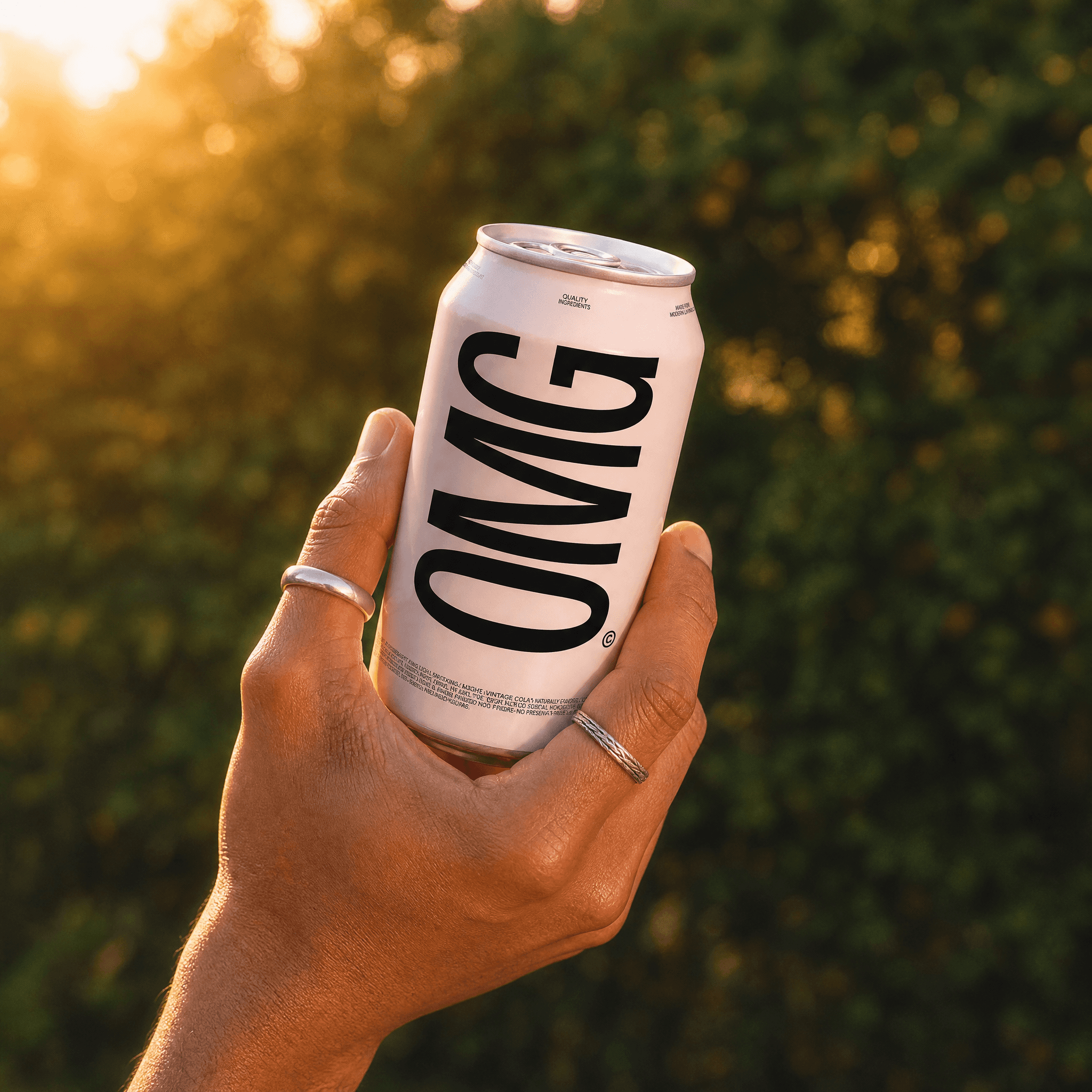
The visual system leans into clashing color, bold type, and sticker-like graphics that were built to be screenshotted. Every asset is designed first for a 9:16 frame.
(WHAT WE DID)
Creative brief
Logo system
Color/type
Social system
Brand guidelines
Art Direction
Shot like a group chat, not a campaign.Shot like a group chat, not a campaign.
Shot like a group chat, not a campaign.Shot like a group chat, not a campaign.
Art direction favors raw, flash-lit imagery and UGC-style framing over glossy beauty photography, keeping every post feeling native to the feed it lives in.
(WHAT WE DID)
Photography
UGC Direction
Motion
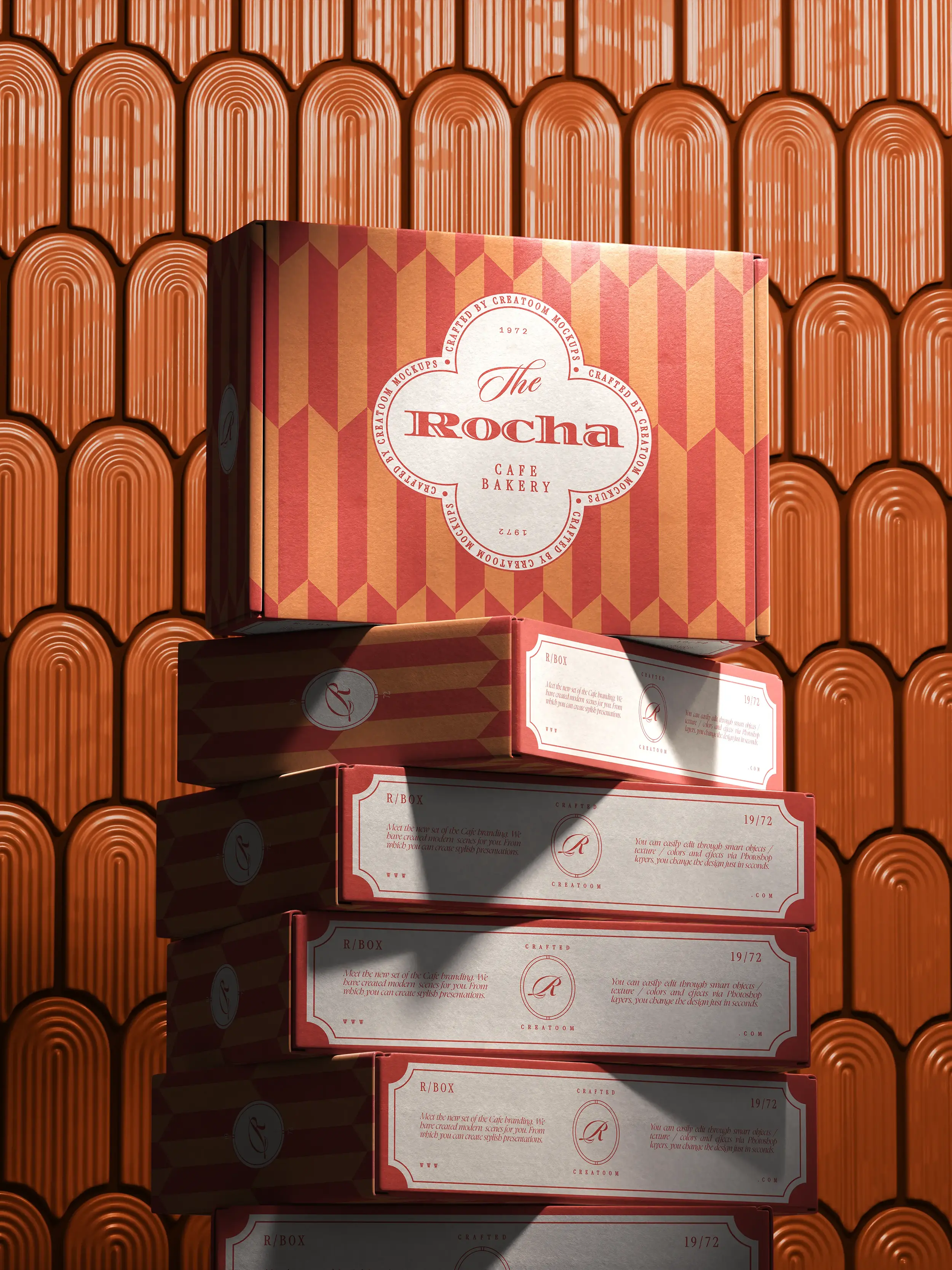
keep scrolling for the next project
The Rocha
✶
Unapologetic branding for a Gen-Z beauty label.Unapologetic branding for a Gen-Z beauty label.
OMG
✶
Details
Brand Strategy
A strategic shift: Beauty, Unfiltered.A strategic shift: Beauty, Unfiltered.
OMG Beauty was fighting for attention in a feed built on sameness. We anchored the brand in radical honesty, positioning OMG as the beauty brand that says the quiet part loud — turning skepticism into loyalty.
(WHAT WE DID)
Vision, mission & values
Audience personas
Positioning statement
Brand promise
Big idea
“
They understood our chaos and turned it into a brand that actually converts.They understood our chaos and turned it into a brand that actually converts.
Priya Osei
CMO, OMG Beauty
Verbal Identity
A voice that talks back.A voice that talks back.
Part hype-girl, part older sister who tells you the truth, OMG's new voice blends Unfiltered, Playful, and Fierce pillars into copy that feels like a group chat, not a campaign.
(WHAT WE DID)
Voice persona
Voice pillars
Elevator pitch
Value propositions
Message library
Visual Identity
Maximalist by design.Maximalist by design.
The visual system leans into clashing color, bold type, and sticker-like graphics that were built to be screenshotted. Every asset is designed first for a 9:16 frame.
(WHAT WE DID)
Creative brief
Logo system
Color/type
Social system
Brand guidelines
Art Direction
Shot like a group chat, not a campaign.Shot like a group chat, not a campaign.
Art direction favors raw, flash-lit imagery and UGC-style framing over glossy beauty photography, keeping every post feeling native to the feed it lives in.
(WHAT WE DID)
Photography
UGC Direction
Motion
keep scrolling for the next project
The Rocha
✶